Graphs and Maps
Variables
Every experiment makes use of variables, constants, and controls. Understanding what these things are is important. The word variable means "changing." There are two types of variables found in an experiment: the independent variable (IV) and dependent variable (DV).
Independent Variable: The experimenter changes this or it changes on its own (time).
Dependent Variable: This changes due to the experiment.
Constant: This stays the same throughout the experiment.
Control: This serves as a baseline for the experiment; something to compare the results to.
Hypotheses are typically written as "If...then..." statements. Taking into account the variables, hypotheses are thus written in this format: "If (IV), then (DV)." So, if you're given a statement in this form, you can figure out the independent and dependent variables by how the hypothesis is written.
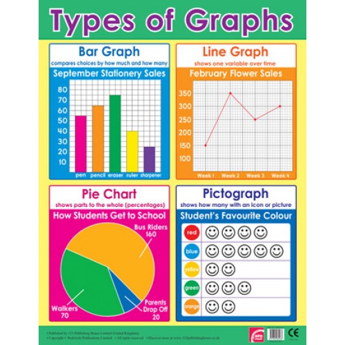
Graphs
Graphs can come in many different forms: line, bar, pie chart, scatter plot, etc. The most common graphs are the bar graph, line graph, and pie chart.
Line graph - shows change over time
Bar graph - compares multiple groups of information
Pie chart - shows percentages
Graphs are typically drawn as the DV versus the IV. IV is usually on the x-axis and DV is on the y-axis (but not always).
Graphing Practice Games
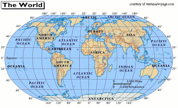
Latitude/Longitude
The Earth is depicted as a globe that allows us to view it all in 3 dimensions. In order to find locations on this globe, we have created vertical and horizontal lines that crisscross the globe's surface. These lines provide us with essentially (x,y) coordinates for any spot on the planet.
Latitude lines are horizontal lines that run left to right across the globe, but we read them North and South of the Equator. The Equator is a line that circles the globe halfway between the North and South Poles. The Equator is 0 degrees latitude. The poles sit at 90 degrees North or South of the Equator. Latitude lines are called parallels.
Longitude lines are vertical lines that run up and down from pole to pole, but we read them East and West of the Prime Meridian. The Prime Meridian goes from the North Pole to the South Pole through Greenwich, England. This represents 0 degrees longitude. On the other side of the globe, there is the International Date Line which is 180 degrees longitude. All other lines of longitude (meridians) will measure East or West.
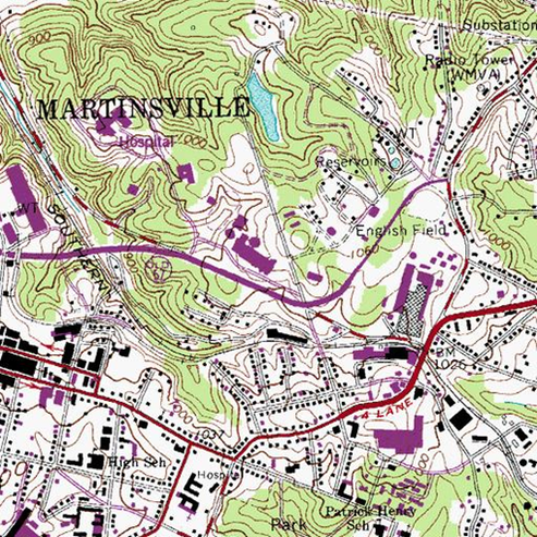
Topographic Maps
Topographic maps show a 3D world in 2D. Initially, topographic maps (contour maps) look like a bunch of squiggly circles. But these circles are what you would get if you sliced the landscape up in smaller and smaller circles based on its elevation. Contour maps make use of contours which are lines connecting points of equal elevation. These lines are separated based on the contour interval. This is the difference in elevation from one contour to the next. Typically, one out of five contours will be an index contour. An index contour is thicker, darker, and has a number on it. This allows us to find where we are on the map without starting at the edge every time. If a contour has hachure marks or tick marks inside it, then it indicates a decrease in elevation as would be found in a basin or pond or lake. When a river or stream crosses a contour line, it causes a slight drop in elevation which results in a "V" shape in the contour. The point of the V always points upstream with the water flowing in the opposite direction.
When you see a contour map, my advice is to first determine the contour interval. In most cases, it will be given to you at the top or bottom of the map. But, in instances where it isn't given, you need to find 2 consecutive index contours. Calculate the difference (subtraction) between these 2 numbers, then divide the difference by how many lines separate them (usually 5). For instance: 200-100=100; 100/5=20.
National Parks Interactive Topo Map
